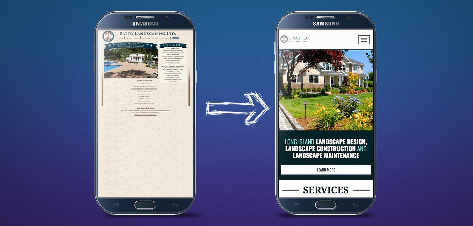
I’m always astonished at the number of small businesses I see with websites that aren’t optimized for mobile devices.
The reasons (or rather, excuses) I hear are numerous, but not a single one of them holds up to even the tiniest bit of scrutiny.
These business owners just can’t imagine a scenario where their customers would be using a smartphone to view their website.
Often, the reality is that they choose not to utilize mobile technology for themselves, then they apply their own behavior to others without doing the research.
Well the data is in and if you’re one of the few who don’t utilize mobile devices this way, you’re in the minority.
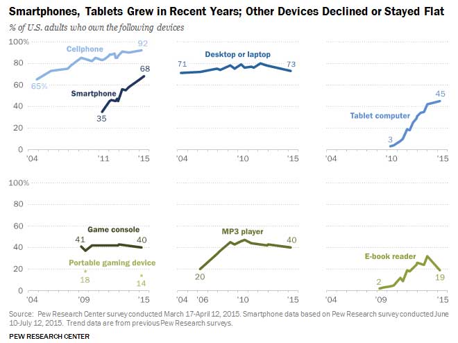
And being an outlier means your own behavior is the last place you should look to find ways to properly serve your users.
I recently had a potential client tell me, “My clients are landscapers, they don’t know anything about technology, they’re not going to look at my website on a cell phone!”
Really? Because I do a lot of work in the landscaping industry and I don’t know one landscaper that doesn’t basically run their entire business on the road from their smartphone.
The mobile-friendliness of your website matters … a lot.
And not just because your users have them (although we’ll get to that in a minute), but for a number of other reasons as well.
For one, beginning with it’s April 2015 update (dubbed “mobilegeddon”), Google now counts mobile-friendliness as a ranking signal.
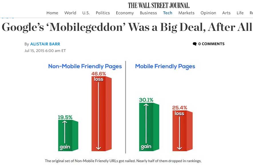
Source: The Wall Street Journal
Since that update, Google has further increased the importance of mobile-friendliness as a ranking signal for search results, indicating an ever-increasing level of importance being placed on content designed for mobile devices.
Google’s aim in all they do is to serve the highest quality results for your search, period.
For a user on a mobile device, that means showing websites that will load quickly and look nice on that device.
Even if that user isn’t on a mobile device, Google will still assume the webmaster that has taken the time and effort to create and serve mobile-friendly pages is providing a better user experience across the board than the webmaster that’s decided they don’t care.
The bottom line: Mobile-friendly websites rank better in search listings.

Expanding on that, Google uses quality scores to rank paid search listings.
What that means is that you can bid as much as you want for some keywords but if Google doesn’t think a user will click your ad, or if they do click it, they’ll not be happy with your site when they get there, they won’t show your ad.
Yes, that’s right. Google will go out of their way to make less money off an ad if it means showing the user a higher-quality result.
Of course, that’s why people return to Google to do all of their searching, it’s simply Google’s investment in their product.
That means if you’re an AdWords advertiser, spending the money to make your website mobile-friendly will actually save you money on your Google ads (you did read my article about the difference between cost and value, right?).

Then there’s the argument presented at the beginning of this article, that your customers aren’t viewing your website on their phone.
First, you need to understand that a mobile device isn’t just a phone, and responsive design (which is how we design mobile-friendly – really mobile-first – websites today) is more about catering to the size of the window in which your website is loaded, not the actual device that was used to load it.
Yes, that means very small devices like smartphones, but it also includes tablets, various sizes of desktop monitors, and even just individual user preferences on the size of the browser window they prefer to use.
For example, Windows has generally always been a full-screen per window operating system, which the Mac and Mac users traditionally open screens to a smaller size within the monitor.

A responsive website design means your website will display the way the designer intended no matter the user’s individual preferences.
That being said, mobile is the primary reason for the advent of responsive design techniques.
Note that I also mentioned mobile-first design, which is the idea that we now design to the smallest screen first, rather than taking the desktop design and trying to make it work for a mobile device.
Designing to the smallest screen first forces the designer to be creative and focus on serving only the most important information in the order that is most beneficial.
From there, it is far easier to translate a limited design to a nice, large desktop screen than it is to work the other way around.
Why do you care?
For one, your users ARE using mobile devices.
I don’t care what you do and who your customers are, it’s happening.
Don’t believe me? Look for yourself!
Open your Google Analytics dashboard, under the “Audience” tab, expand the “Mobile” section and click on “Overview.”
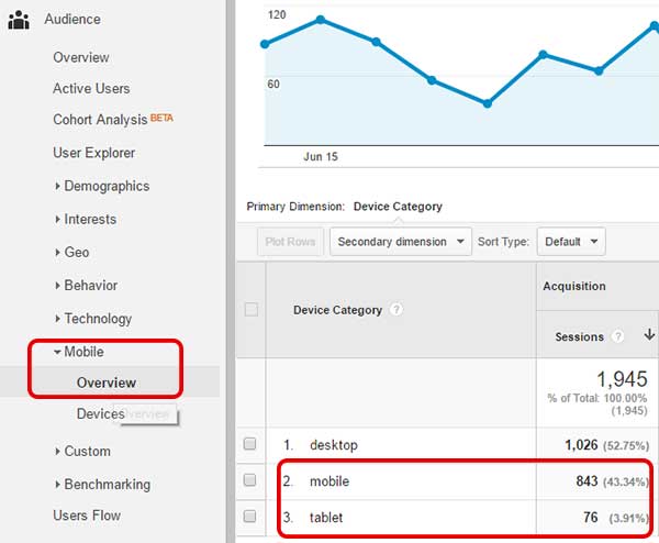
(Also check out The Argument Against Collecting Website Analytics.)
Here you’ll be able to see real numbers for your actual visitors. You should also note the bounce rates and average session durations listed in this report.
Your bounce rate measures the percentage of users that viewed one page on your site and then left.

A high bounce rate indicates a problem keeping users engaged on your website.
If your bounce rate is significantly higher on mobile devices than on desktop devices, it would indicate a likely issue with the way your site displays on a mobile device.
Session duration measures the average amount of time each user remained on your website.
Again, a much lower session duration on mobile devices would indicate that your users are getting frustrated quickly and leaving.
Not seeing much in terms of mobile and tablet traffic in your report?
The most likely reason is most likely because your site isn’t mobile-friendly, you’re not getting the search or social referral traffic you would be getting if it was.
As I said, the usage is there, if you’re not seeing it, it’s because you’re not doing something right.
Everyone knows smartphones trend young, but as of mid-2015, 30% of US adults over the age of 65 owned a smartphone, and that number has only continued to grow.
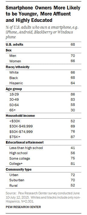
Even if your demo falls in that age range, if most of your customers or prospects are college-educated or above the median income range, the percentage of your potential customers that own a smartphone is significantly higher than that.
But even if it wasn’t, would you really want to miss out on 30% of your potential customer base?!
Not making the investment to make your website mobile-friendly is simply another case of being penny wise and pound foolish.
Effective small business management is about maximizing value at every turn. Make your website work for you the way it should.

