NULL
Many of our clients are not aware of the differences between printing processes. Although much of our printing projects, both digital & offset, are completed in four color process rather than spot PMS colors, we would like to explain the process of printing with the Pantone Color Matching System.
A typical type of job that would require PMS ink colors would be stationery such as letterheads, envelopes, and business cards. Using consistent ink colors for a logo or corporate branding purposes is a necessity. This will strengthen your identity, and the right combination of color can make your company stand out. These standard PMS colors, selected for your company stationary, will be referenced across other industries to reinforce your branding. Vehicle wrap, uniform, signage, and many other promotional item companies understand the PMS color matching system and require your PMS color choices to ensure the best possible color matching
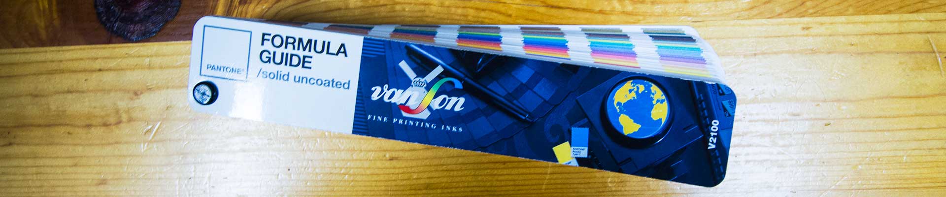
Commercial print shops rely on a color ink standard known as the Pantone Color Matching System otherwise know as the PMS color guide. This, regularly updated library of standard ink colors offers a wide spectrum of color. Pantone releases new swatch books on a regular basis that represent the ink color on both coated and uncoated stocks. These swatch books provide the pressman with the ink mix ratio to achieve each specific ink color.
It is important that clients understand that this is the print industry standard for color matching. This standard is used to ensure accurate and consistent color for print.
Clients sometime bring samples of color for us to match. Whether it is a photograph representing company vehicle color, or the color of their uniform, we find the best and closest match in the PMS book and mix the ink custom.
Quite often we are asked to match a color referenced by an image on a cell phone, tablet, or computer monitor. We will again, use our best judgment to match the color based on the device we are viewing the color on. But, keep in mind… every device and monitor will display color differently. There are many variables to consider with viewing color on a screen including resolution, view angle, and different color lookup tables. Once a decision has been made with regards to a selected PMS color, the variations between viewing devices will at least be consistent.
Proofing these colors can be done two ways. Our standard proof is done on our Epson wide format printer. This proofing system emulates the ink color on a standard white coated stock. PMS, as well as CMYK process inks will appear differently on different stocks. The PMS book has covered the two most basic stock options, coated and uncoated samples are given for every ink color offered. But, color stocks, such as cream, ivory, natural… all will change the color of the ink’s appearance.
The most accurate way to see the results of PMS inks on these stock colors is to run a press proof. This proofing option will cost almost as much as printing the actual job, because it essentially requires the same process as a typical print project. We digitally prepare and rip a file, output plates, mix ink, hang plates, and run on press. This type of proof is reserved for color-critical jobs… print projects where color branding and matching is essential, down to the last detail.
So as explained here, selecting PMS colors for your company is an important first step to consistency in brand and identity marketing efforts. Take the time to sit with a designer and carefully select the colors that would best represent your company. Hopefully, understanding this process better will make your color selection process easier and much smoother for your designer.